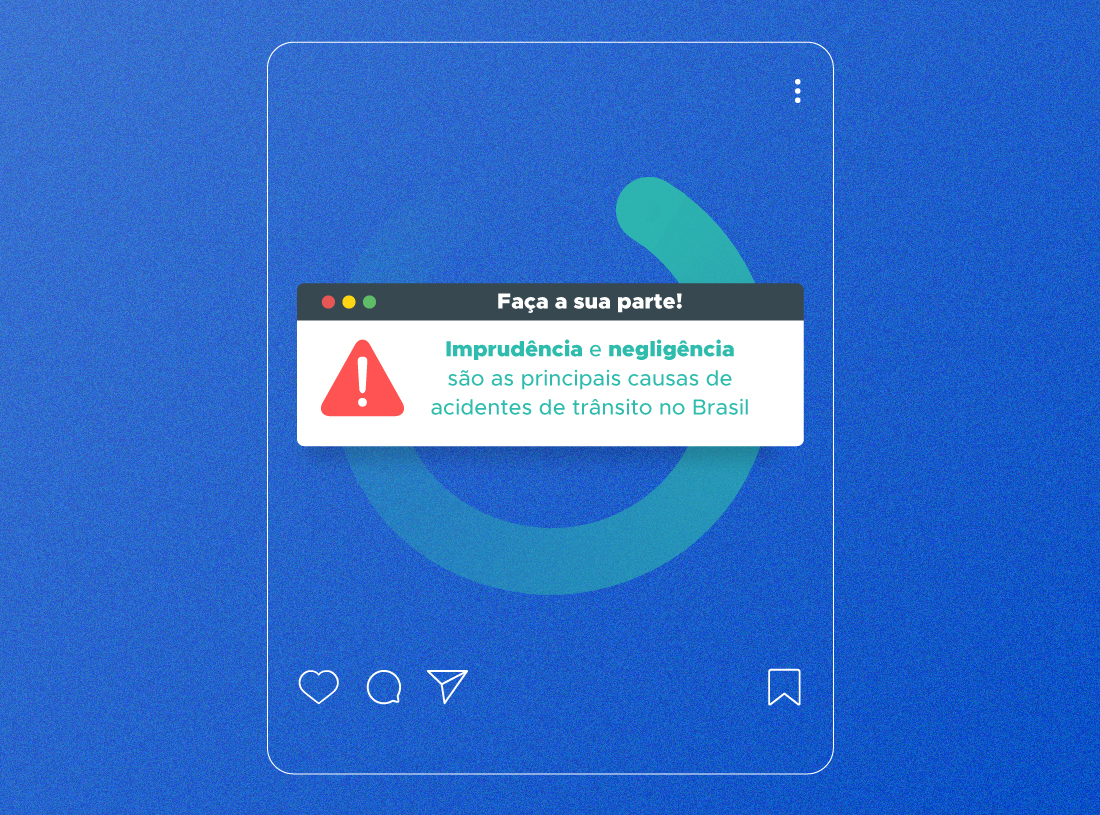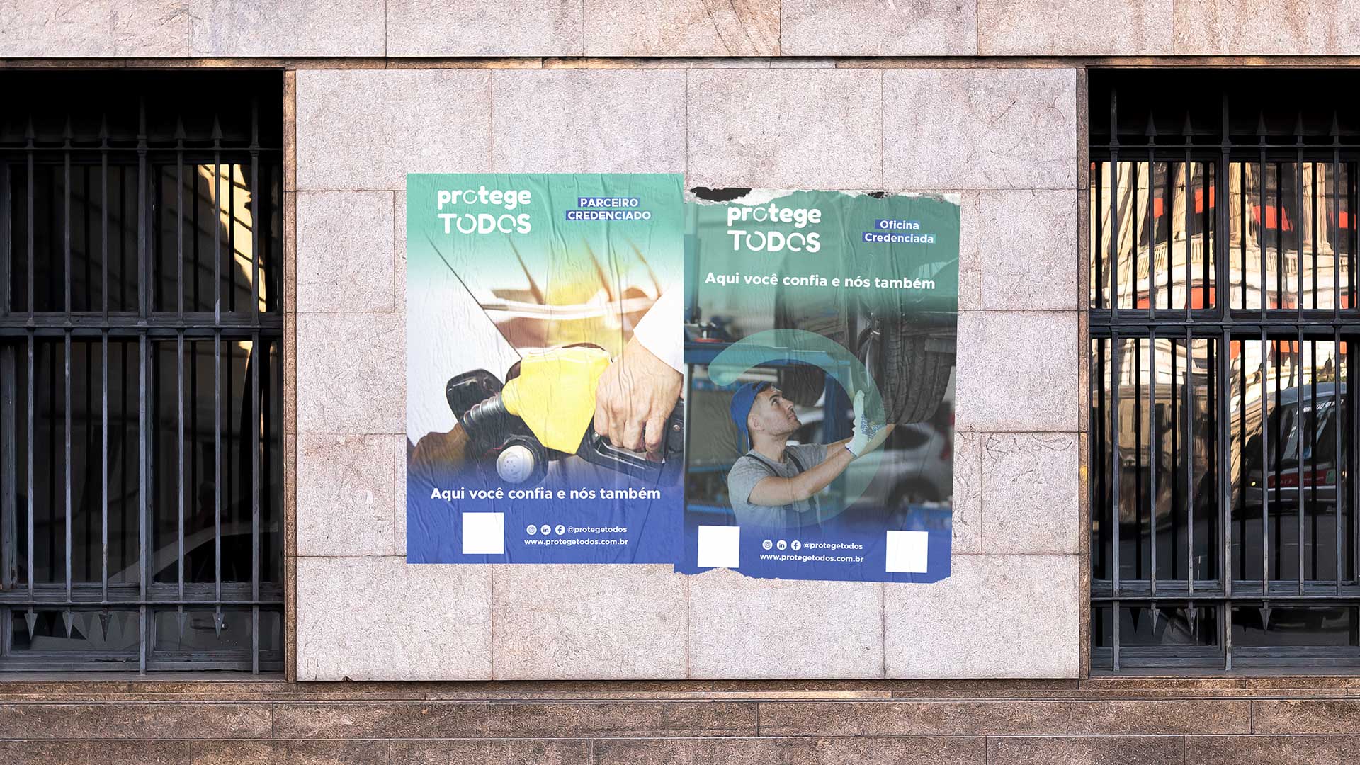
Protege TODOS is a company specializing in vehicle protection with diverse services and assistance throughout Brazil. ORA’s mission in this project was to propose a new identity, presenting a new brand and colors that communicated the credibility and security of Protege TODOS.
For typography, the proposal was to use the symbol of a circle as if it were in constant movement, meaning union and welcoming. The brand is completed with the fredoka one typography, which has rounded edges. Finally, the colors chosen in two shades of blue, one darker, to convey security, credibility and confidence, and another lighter, which brings serenity and tranquility. At the same time, it dialogues with the digital environment.